
Tags
Our 52 Ancestors prompt this week is “Origins”. Origins are simply beginnings.
I’m currently focusing on my dad’s side of the family. As I continue to dig deeper, it has occurred to me that Dad’s ancestors haven’t really concentrated in any one area for any length of time. To get a feel for his origins, I decided to plot birth locations for his ancestors going back to the Revolutionary War.
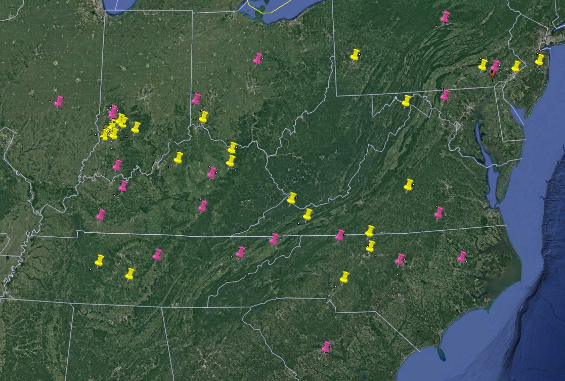
The yellow pins are the locations where ancestors from my grandfather’s line (my dad’s dad, the DeMosses) were born. The pink pins are where my ancestors from my grandmother’s line (my dad’s mom, the Fieldens) were born. These are only my direct ancestors–no aunts, uncles, or distant cousins. Each pin represents a location, not necessarily a person. Some pins may represent more than one person. I did not connect the pins because I wasn’t necessarily trying to track how they migrated, although it was clearly east to west.
It’s quite the scattering of locations. My grandmother’s ancestors tended to be more to the south, with a higher concentration of locations in the Carolinas and into Tennessee. There really isn’t a distinct concentration of locations in any one area. They seemed to always be moving. Considering the terrain of North Carolina and eastern Tennessee, it would seem logical that they continued to look for better opportunities.
My grandfather’s people seem to have come from two different areas and converged on the southwestern portion of Indiana. One grouping appears to have originated from the New Jersey/Eastern Pennsylvania area, while the other was from the North Carolina/Virginia area before migrating north and westward. When the DeMoss ancestors arrived in Indiana, they must have found what they were looking for. The large cluster of yellow pins represent several generations who put down some serious roots, at least for a while.
The data represents five almost complete generations and a partial of the sixth generation, starting with my grandparents. Birthdates of those included ranged from the 1770s to about 1920.
If nothing else, the data plot gives me insight into the areas of the country I should delve deeper into when the opportunity arises.
Map created using Google Earth application.
